Tuesday, 14 November 2017

Thursday, 9 November 2017
Digipak development
| For my digipak i started off with a plain blank screen and downloaded the template. |
 |
| I looked at all the different colours that i could use and what existing bands have used in this genre. When i came across this shade of pink it really caught my eye and i felt it looked really good once you add some black and white to it. By having a bright colour like this, it will also capture the audiences eye, which is important as that is how you will sell you product. |
 |
| I chose to fill the back and the front cover with the same colour pink because i wanted to keep it looking simply yet effective. I then search for different fonts to use; i wanted one that suits the genre but also looks different to anything anyone else who/has used. When i came across this font i fell in love with it and thought it looked really good in white against the pink background. I wanted to keep the writing clear because it is important for the audience to be able to read the words. I chose to have the title of the band and the title of the album on the front cover so that our audience can notice us. I use the shadow effect on the "1 Second Riot" on the CD because i felt it looked different to anything that i have seen in my research. |
 |
| I then used the same font again for the back of my cover because i wanted to keep to a maximum of 3 fonts so that the digipak looks neat and tidy. I added the bar-code and record label sticker on the back to follow the conventions of a professional dipipak. Also i added on all the legal writing underneath the song names. I stuck to only having eight songs on my album because this is what Kasabian and Oasis have done in the past, so therefore it fits with the genre. |
 |
| After i finished the back of the digipak i then created the spine. I chose to do this in a dark black because i liked the idea of using three colour, pink, black and white. On the side i rotated the wording so it correct and easy to read when you have the album stacked up. On the spine i have wrote the cataloger number, album name and band name, i did this because the fit the correct conventions but also to allow people to read the pack without having to get it off the shelf. I used a different font for this because i needed to be more easier to read on a smaller area, also i did not want to over use it, as i have already used it a lot. |
 |
| Next, i added a picture of the band on the front cover, this is to added an effect and to show who we are. |
 |
| To fill the space inside i chose a picture that i took and edited to make it stand out my more and to fit with the rest of the digipak. I also chose to make it look blury as i wanted to make it fit with the CD. |
Digipak analysis
The Ariana Grande digpiak for the album ‘My everything’ has
a very simplistic as the colour pallet for this is black and white. This is a common
palate used by Ariana as this signifies her genre, which is pop. Also, the use
of a dark back ground highlights the main image of Ariana which is normally
what the artist aims to do as they want to promote them selves to sell the
album. As well as that, it is important that the customer can put an image to
her name, as she is more of a new artist, unlike artist such as Kasbain where they
don’t necessarily need to use an image as they are such a well known band. By
using these two colours is gives the album a very sophisticated and classy
look, which is always a positive as it suits the artist due to her styling and
brand image.
The camera angle of the artist in the main image has been taken
in away that it shows her feminine side due to it being a quite feminine pose.
This could be because her intended audience is mainly females so she is trying
to connect with her customers, which identifies the album as being more girly. In
correlation to this, the artist is wearing an outfit that suits a feminine stereotype,
which is that girls like to have an outfit that matches and looks girly, for
example she is wearing a black top and black shorts with some white heals. The
artist in this case is wearing little clothing, showing a lot of skin off on
her leg, this could be to attract a male audience to the album to promote it
even more.
The artist has followed the conventions of common media
products, for example she has writing the title of the album across the middle
of the page. This is so that the customer can recognise which album is on sale
and will instantly be able to remember it for future reference. The title is writing
in a very feminine text which again corresponds with the rest of the digipak,
as her intended audience is mainly females, but also he artist her self is a
female. She has also used the rule of thirds by placing the image and writing in
the centre of the page, this makes it stand out to the customer’s eyes to help
promote the album.

Digipak analysis
The colour palette of the Kasabian digipak for their album
48:13 is very simplistic as it only consists of two colours, pink and black.
The use of the pink is very effective as it makes the album stand out on the shelf
over any competitors. It is also a very unusual colour to have which would make
the customer think twice about it, which could determine why they bought it. The
use of the bright pink is also very energetic which relates to the style of
Kasabian. The use of the black, bold font makes the writing stand out, which is
important as you want the customers to be able to recognise the writing from a
distance and to instantly know its Kasabian. The writing consists of the band
name, album title and the track list. This is an important convention to have
on a digipak as this is the key information that needs to be shared with the
customers so that they can remember the bands name and etc. The font that has
been used by Kasabian is a trade mark font; this font gets used throughout many
of their other albums. They have done this so that they can be recognisable
even if they didn’t put their band name on the cover. They will use this font
throughout all of their media products for this specific album so that customer
recognises the album immediately and link it to Kasabian. This will then keep
replaying in the customers mind and hopefully force them to buy the product,
and could potentially attract more customers.
Kasabian have used the same font and colours for the track
list on the back cover, this specific font is again very simple, but effective.
They have used a black, bold font that will stand out over the pink back ground.
This makes it easy to read and stands out to the customer’s eyes, helping it
sell. This will also attract potential customers which are exactly what
Kasabian aims to do, as they are trying to sell the product and increase their
fan base.
Unlike many other bands Kasabian haven’t included a main
image, or any image at all on this digipak. This is because there is no rule to
say that they need to, as many other artist have done this as well, for example
Coldplay ‘Mylo Xyloto’, Pinkfloyd ‘Dark side of the moon’ and ACDC ‘Black ice’,
and these all albums that are very popular.
Kasbain have followed other conventions of this media
product as they have included the rule of thirds. They have applied this buy
placing the text in the centre of the page with leaving two other thirds either
side. This allows the text to stand out and be captured by the customer’s eyes.
This convention has also been used on the back as the track list is placed
centrally, having the same affect as the front cover does. Kasabian have also
included a barcode as this vital so that customers are able to purchase the
album. The record label and distribution logos have been added to the back on
the album in the bottom left corner, as these are requirement set by the
companies, for promotional purposes.


Digipak analysis
The Arctic Monkeys album ‘AM’ has a very simplistic front
cover for its digipak, as the colour pallets they have used it very simple and
plain colours, such as black and white. This is because they have wanted to
keep the same colours used throughout all of their media products, for example
on the album advert; the colours are black and white as well. They have done
this so that the customers recognise and link the two products together which
will help promote and sell the product. This is because the customers will
instantly see these products, link them together and remember that Arctic
Monkeys are bringing out a new album. Also, this chosen colour scheme is
commonly used throughout the alternative rock genre, which keeps this album
stuck to the conventions that Andrew Goodwin stated. This front cover consists
of no main image apart from a sound wave. This makes the album stand out from
the crowd as a lot of albums on the shelves have main images. During an
interview the lead singer of the band, Alex Turner mention that the sound wave
looks like a bra, this relates to the songs within the album that the majority
of them talk about females. In correlation to this, there is no band name on
the front cover, this is due to the fact that this image was created by the
band so customer can instantly relate the album with The Arctic Monkeys; also,
as The Arctic Monkeys are such a well known band, they don’t need to display a
main image of themselves as fans/customers already know who they are and what
they look like. The artists have used the rule of thirds for this album cover,
as they have used this different type of main image in the centre of the page.
The back of the digipak contains the track list, this is
important because the customers want to know what songs are included on the
album, as they may have heard some signals before the album was released. This
helps sell the product as some customer may like certain signals and would help
towards their reason of buying the full album. Also, it allows customers to
know what songs they are listening. The fonts that have been used on the back
cover are fonts that have been used throughout the alternative rock genre; they
have done this to keep the album under their chosen genre. The font that has
been used is the same that has been used on their advert, this is again been
done so that customers/fans can relate the two products together. The font is
also is easy to read as it is a clear, white font on a black back ground. This
has been done so that the words stand out to the publics eyes and that it is
easy to read, otherwise this product could be hard to sell. The Arctic Monkeys
have stuck to another convention stated by Andrew Goodwin; this is that they
have included the record label at the bottom of the page. This is important because
this is a demand of the record label so that they get marketing and promotions
they want. This is so that future artists can see what record label produced
this album and can use their work in the future, which will give them work and
a source of income.


Tuesday, 7 November 2017
Draft music video feedback
 |
| We got positive feedback on this shot because the negative colour fits our chosen genre. As a result of this we will be keeping this editing for our final video, but also we are going to add in this effect more when it is just shots of cam and jack. |
 |
| For this shot we got positive feedback as the camera transition from myself to Josh works really well. Therefore we are going to take this and try and use more off it. |
 |
| For our opening shots we are going to add a big, bold, colored title over this blank screen to introduce the band and the song. This title will simply say "1 Second Riot" and "EEZ-EH". This is going to make our music video look more professional.
As well as that, we are going to try and avoid using static camera shots because these do not fit our chosen genre. So as a result of this we are going to analysis more of Kasabians, Oasis and the Arctic Monkeys music videos to see what camera angles they have been using. From already doing some research, i have found that they use a lot of close up shots of the lead singer. We are also going to take out the shots that involve the car and try and speed up the editing and movement. To ensure that we get all marks possible we must make sure that our video last for at least 2 minutes and 30 seconds.
|
Sunday, 5 November 2017
Album cover advert production

Wednesday, 1 November 2017
Monday, 30 October 2017
Story board and planning for the final music video
This was our final storyboard that we followed and to look
when filming our final shots, for our final video. This story board is
different to our story board because this does not include pictures. The reason
behind this is because we felt that it became very time consuming, we also
found that our ideas changed a lot during our filming of our draft. We also had
a rough idea of what we wanted to film, and then we would adapt it slightly on
the day. Also, the way that we had planned out music video go, is very flexible
as we wanted to just create some funky dance moves on the spot, this would have
made the story board very hard to drawl. Also, we knew that our video was going
to consist of a lot of fast paced editing and different effects; this would have
also been very hard to draw on the story board.
As a result of this we only included the initials of our names on the
specific scenes that we would each take part in. For example, J = Jack, JB =
Josh, C = Cam , G = George.


Friday, 27 October 2017
Day 6 filming
Today we went out into Lutterworth to get the car shots filmed. We only managed to get a few clips recorded though as we were running out of time. As a result of this we are going to replace these shots with a blank screen. Filming today didn't go as smoothly as we hope as we get getting interrupted by other traffic and the lighting for the shots kept changing.
Wednesday, 25 October 2017
Day 5 filming

Here are some images of behind the scenes from today's filming.

Tuesday, 24 October 2017
Day 4 filming
Today we did some more filming for the blue outdoor shots. The filming went went well as we managed to get all the shots done that we planned for. However, we did have some interruptions with traffic and people walking past, but we did expect this as we were filming in the town.
Monday, 23 October 2017
Day 3 filming
Filming today for the third time has been the best so far. We have changed location from the studio to the country park in Lutterworth. These shots included me and the other members of the group dancing around on the bench. We also took some other shots that involved using props such as milk.
Filming at a new location was very fun and allowed us to experiment with our work. But it was the first time we had used a natural lighting and background for our music video. As a result of this, we did have a few difficulties though where the camera wasn't focusing and trouble with the wind. However, we knew we were going to have these issues, so we tried to avoid recording on day where the sun light was bright and only recorded our shots when the wind had died down.
Sunday, 15 October 2017
Friday, 13 October 2017
Filming day 2
Today we began filming the red box shots on the story board. These shots were of me and the other members in the group dancing around and doing random acts during the shots. The filming today was very easy as we all knew what to record and the exercise ran very smoothly. This is why having a storyboard is extremely important because it has helped us dramatically with our filming. Today we were able to get a lot of shots done in a short space of time.
Album advert draft

Thursday, 12 October 2017
Prop ideas
During the planning stage of this project we decided that we
wanted to involve props during our video, this is because this will make our
video stand out more and look better with more props. This is because we researched
into existing media products in this genre and others, and we found that a lot involve
props. Therefore, we came to conclusion that we needed this. We wanted to choose
props that are very random and wacky which corresponds with our song and genre.
Below is a list of props that we have thought about…
Pack of cards
Sunglasses
Guitar
Golf club
Edible food
Mask
Wigs
Chair
Hats
Sports fan cushion finger (if found)
Boxing gloves
Cooking equipment (frying pans etc)
Costumes
Pillows
Drum equipment
Bongo
Tambourine
Dolls
Mario kart steering wheel
Teddy bears etc
Rip stick
Wednesday, 11 October 2017
Day 1 filming
Today we started our first day of filming for our draft music video. As a group we decided that we should start filming all the studio shots before we do any others. This is because these shots are the easiest and can be done immediately.
The day started with us looking at the storyboard so that we could work out what shots were needed to be filmed. We then got into our chosen outfits and recorded each shot as they come. This activity wasn't new to us as we had already done some filming in the past, but we defiantly learnt new skills on how to set the lighting up so it doesn't look bad on the camera. I found this exercise very fun as the ideas were all our own and bringing it to life feels great.
The day started with us looking at the storyboard so that we could work out what shots were needed to be filmed. We then got into our chosen outfits and recorded each shot as they come. This activity wasn't new to us as we had already done some filming in the past, but we defiantly learnt new skills on how to set the lighting up so it doesn't look bad on the camera. I found this exercise very fun as the ideas were all our own and bringing it to life feels great.
Sunday, 8 October 2017
Wednesday, 4 October 2017
Rule of thirds

Tuesday, 3 October 2017
Filming Schedule
OCTOBER
Monday the 9th. Blue shot filming. After school.
Wednesday the 11th. Black shot filming. Lunch time.
Friday the 13th. Red shot filming. Lunch time.
Green shot filming to be confirmed.
Monday the 9th. Blue shot filming. After school.
Wednesday the 11th. Black shot filming. Lunch time.
Friday the 13th. Red shot filming. Lunch time.
Green shot filming to be confirmed.
Story board key
* = Studio location
+ = Outdoor location
Different coloured boxes in corners of frames = different outfits
Frames with no coloured boxes (outdoor ones at the end of story board) wear blue box outfits.
RED box
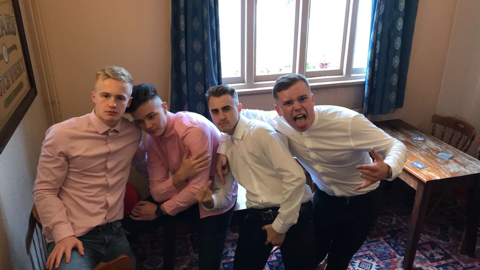
Jack - Pink sweater. Sunglasses. Blue jeans. Trainers
Cam - White polo. Blue jeans. Trainers.
George - Black jeans - White tape. Blue Jacket. Trainers.
JB - Stone island top. Blue jeans. Trainers.
BLUE box
Jack - Vest. Trainers. Trunks.
Cam - Mink. Black jeans. Trainers. Sunglasses.
George - Blue jeans. No top. Safari hat. Sunglasses. Trainers.
JB - Sunglasses. Short shorts. Blue jacket. Trainers.
GREEN box
Jack - Pink shirt. Black jeans. Brogues
Cam - White shirt. Blue jeans. Brogues
George - Shirt - white. Black Trousers. Brogues
JB - White shirt. Blue jeans. Brogues
BLACK box
Jack - Sunglasses, Black sweater.
Letters in brackets are initials of who is in the shot.
J = Jack Astill
C = Cam Quinn
G = George Anderton
JB = Josh Ballard
Numbers positioned top left of text below frame = time in the song for which the shot takes place
+ = Outdoor location
Different coloured boxes in corners of frames = different outfits
Frames with no coloured boxes (outdoor ones at the end of story board) wear blue box outfits.
RED box
Jack - Pink sweater. Sunglasses. Blue jeans. Trainers
Cam - White polo. Blue jeans. Trainers.
George - Black jeans - White tape. Blue Jacket. Trainers.
JB - Stone island top. Blue jeans. Trainers.
BLUE box
Jack - Vest. Trainers. Trunks.
Cam - Mink. Black jeans. Trainers. Sunglasses.
George - Blue jeans. No top. Safari hat. Sunglasses. Trainers.
JB - Sunglasses. Short shorts. Blue jacket. Trainers.
GREEN box
Jack - Pink shirt. Black jeans. Brogues
Cam - White shirt. Blue jeans. Brogues
George - Shirt - white. Black Trousers. Brogues
JB - White shirt. Blue jeans. Brogues
BLACK box
Jack - Sunglasses, Black sweater.
Letters in brackets are initials of who is in the shot.
J = Jack Astill
C = Cam Quinn
G = George Anderton
JB = Josh Ballard
Numbers positioned top left of text below frame = time in the song for which the shot takes place
Risk assessment
1. Situation
Using a tool such as a sledgehammer to smash a watermelon.
Risk
The tool makes contact with a person or another object it wasn't intended to hit.
Solution for prevention of risk
Make sure the area the swing is taking place is clear of people and other unintended targets.
2. Situation
Shots from within the car when its driving.
Risk
The driver becomes distracted and loses control of the car.
Solution for prevention of risk
Ensure the driver keeps up his concentration and no one speaks to him or touches him.
3. Situation
Milk being poured on George.
Risk
The wet surface caused by the situation could cause someone on set to slip over and injure themselves.
Solution for prevention of risk
Make sure everyone on set is aware of the wet surface and is cautious of it.
4. Situation
Doors being shut when people are entering the car in shot.
Risk
Someone gets their finger, hand or foot trapped in the door.
Solution for prevention of risk
Ensure that when filming, everyone opening and closing car doors is being cautious of potentially harming themselves and avoids the hazard.


Sunday, 1 October 2017
Friday, 29 September 2017
Monday, 18 September 2017
Sunday, 17 September 2017
Friday, 15 September 2017
Pitch feedback
All of age ranges
17-18 years old.
Male and Female
Positives:
"You have the
space to be creative"
"Good song
choice and inspiration"
"Some
interesting location ideas and interesting band name"
"Good styling
ideas and song choice" x2
"Ideas match
the styling"
"Ideas match
the genre" x3
"Well thought
out idea"
Negatives:
"Rooftop shots
may be difficult due to lighting and security issues"
"Security
issues when filming on rooftop" x6
"May need a
back up location if rooftop shots are not possible"
From looking at our feedback we have decided to ignore "you have space to be creative". We will ignore this because we feel that this is giving us no information on how to improve or adapt our music video.
As we have had a lot of negative feedback about how taking rooftop shots will be difficult. This has made us change our minds about our filming location as we do not want to put stress on our selves about finding a suitable rooftop, also we do not want to get in trouble with the police or security. As a result of this we have looked at new locations.
Tuesday, 12 September 2017
Pitch
Song choice
Eez-eh – Kasabian
Genre
Rock/ Alternative Rock
Band Name
1 Second Riot
Style of video
Performance Video
Video Inspiration
Oasis – Supersonic
Kasabian – Eez-eh
Oasis – Don’t look back in anger
Locations
Rooftop, Town - Leicester or Rugby
Studio at school
Field/Dirt track
Woods
Country park
Styling
Kasabian Styling. Nothing too extreme.
Lighting ideas
Studio Lights
Advice from teachers on lighting for outside locations.
Subscribe to:
Posts (Atom)